
On Graceful Degradation of Service
This is the door to my in-laws’ apartment.
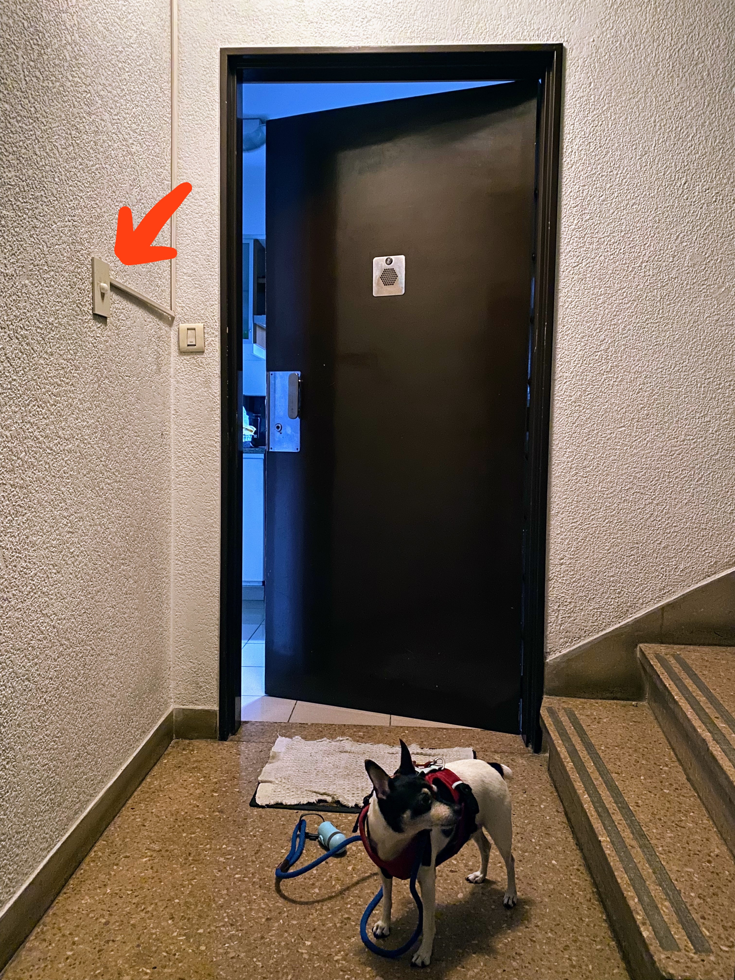
You can safely ignore the puppy; it’s only there for SEO purposes. Focus instead on that thing on the wall, marked by the orange arrow. That is a motion-sensor light switch, the kind that turns the light on when you walk by. Only this one doesn’t because it works like shit. You must wave your hand in front of it, almost touching it, for the lights to come on.
As you can see in the picture, this sensor is roughly placed at the same level a light switch would be. Because of this, when people reach out in the dark, they end up activating the malfunctioning sensor. This is what we call graceful degradation of service. The sensor is essentially being used as a touch button. The motion-sensing functionality doesn’t work, but the system as a whole still works: people are able to turn on the lights when they need them. If the sensor had been placed somewhere else, such as at knee level or on the ceiling, the system would not have degraded gracefully. Things would work as long as the sensor is functioning correctly, but as soon as it’s busted, there’d be no way of turning on the lights. People would reach out in the dark and find nothing. Placing the sensor on the ceiling would also make the whole system harder to maintain, as you’d need a ladder every time you need to service it.
I don’t think anybody thought about graceful degradation when installing the switch. The motion sensor was most likely retrofitted after the fact, repurposing the hole previously used for a regular light switch. We could say that, in this case, the property of graceful degradation comes from leveraging a pre-existing user behavior. We could distill this learning into a product design rule that reads:
When introducing a new feature, leverage existing user workflows instead of disrupting them.
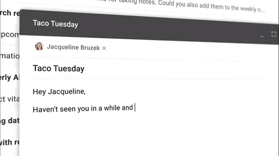
Let’s illustrate this with an example. Not too long ago, Google launched their Smart Compose feature for Gmail. The way it works is you start writing your email and suddenly a grayed-out text appears, trying to guess your next few words. If you like the suggestion, you press tab, and the caret jumps to the end of the line saving you a few keystrokes and leaving you wondering what sort of witchcraft Google is using to read your mind.
Now, Google could have designed this feature in many different ways. It could, for example, open a popup menu with multiple options letting the user select the best one from the list the way this tool does:
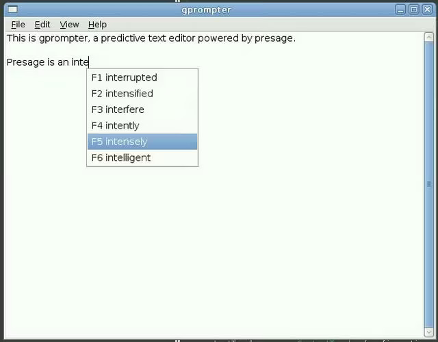
This approach might seem more powerful at first glance because it gives the user multiple options instead of just one. But it has a huge disadvantage: it disrupts the user workflow. Picture this: You’re redacting an essay. You think of a sentence and start writing. Midway through a menu pops up designed to look like it’s on top of what you’re doing. Your hands stop typing. Your eyes dart through the popup content, read the first one, jump to the next line, read the second one, etc. You consider all the options and decide to go with the 4th one. Your hands jump to the arrow keys, and you click click click until the one you want is highlighted, then click once more to select it. All of this happens in a matter of milliseconds. And yet it is enough to break your flow. By contrast, Google’s design, users are offered a single option presented inline, as if the text were already written. With the grayed-out text shown in our visual pathway, the eyes naturally flow to the end of the sentence. We can accept the suggestion with just a single keystroke; if we do, our eyes are already in the right place to continue writing.
You might think Google’s design choice is obviously better and that I’m just cherry-picking a needlessly convoluted example as a straw man. And maybe you’re right. But keep in mind that design, when done right, is invisible. And what might seem like an obvious solution once you’ve seen it can be hard to come up with when you’re thinking a feature from scratch.
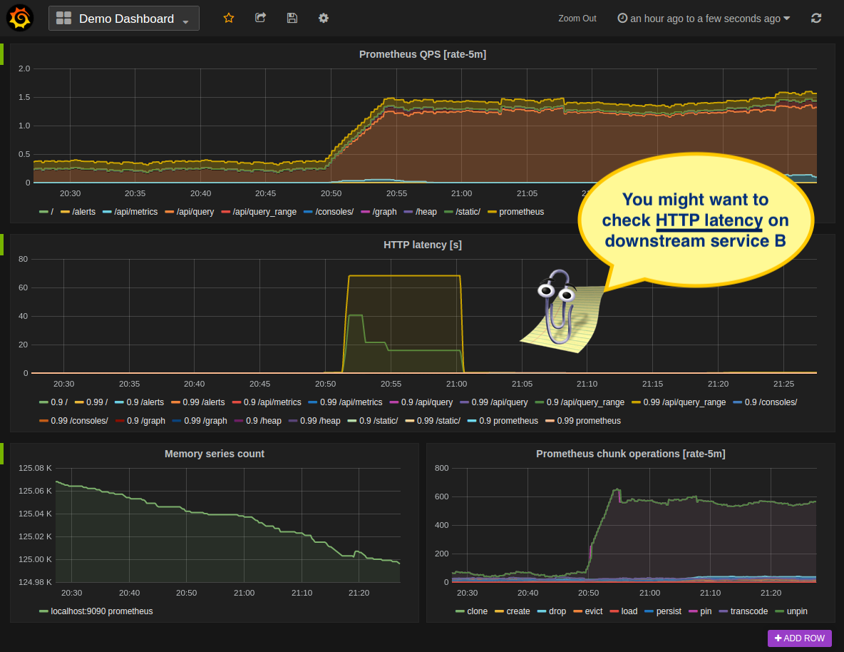
Figuring out the right way to introduce new functionality without disrupting user workflows takes dedication and practice. Often we developers get worked up about the new capability we’re introducing and forget to consider how it fits into the existing user journey. This happened to me not so long ago at Netflix. We were working on a new tool that’d let users discover and analyze correlated system failures that could be causally related. That is, if service A is going Boop! and service B is also going Boop! and we know service A calls service B then there’s a good chance those two events might be related. In some cases, we can even venture that one symptom might be caused by the other, establishing a causal relationship between the signals based on the requests’ call paths. We were super excited to put this new functionality in users’ hands. We were so bullish about it that we envisioned it being the first step in the troubleshooting journey. Users would start by analyzing their service anomalous metric in the context of the overall system health. We created a new tool to surface this kind of relationship between services and took a few iterations to design how we would overlay service health data on this new visualization. What we failed to realize is that we were introducing a whole new way of troubleshooting an incident. Asking users to learn a new way of doing things is always a tough sell. Especially when there’s an outage and things are on fire, users would systematically trust their muscle memory and revert to their battle-tested tools and dashboards.
Instead, we should have emulated the guy that installed that motion sensor in my in-laws' apartment. Rather than introducing a whole new tool, present whatever insight we can gather as part of the existing user workflow. For example, if a developer receives an alert from a failing metric on Service A, we could include any other metrics we think might be related in that same alert. Enriching the alert with additional context giving users a hint on where to look next. Or if they’re looking at a dashboard and notice an anomalous metric, we could then surface a message saying: “Hey, by the way, Service B is also failing in a similar way; you may want to check it”.
 What if Clippy was the peak of UX design?
Instead of adopting an “If you build it, they will come” approach we should have met users where they were at. Presenting key insights in the context of their troubleshooting session and letting them jump to the new tool if they want to dig deeper. A system built this way would degrade gracefully: If the correlation service is down or the suggestion is not good, users can still keep troubleshooting the same way they do today.
